Double Bottom

The Double Bottom technical analysis charting pattern is a common and highly effective price reversal pattern.

The chart below of Altria (MO) stock illustrates the Double Bottom reversal pattern:


To create a double bottom pattern, price begins in a downtrend, stops, and then reverses trend. However, the reversal to the upside is short-term. Price breaks again to the downside only to stop again and reverse direction upwards. With the second bottom of the double bottom pattern, it is usually more bullish if the second low is higher than the first low.

Double Bottom Buy Signal

The signal to buy is given when the confirmation line is penetrated to the upside. The confirmation line is drawn across the top of the double bottom pattern (see chart above).

Often, after price penetrates the confirmation line, price will retrace for a short time, sometimes back to the confirmation line. This retracement offers a second chance to get into the market long.

Volume also plays an important part of interpreting the Double Bottom pattern; this is illustrated in the chart below of Pfizer (PFE):


Generally, volume should explode when the confirmation line is penetrated as it did in the chart of Pfizer (PFE).

The Double Bottom reversal pattern is a heavily used and effective charting reversal pattern. Another similar and popular bottom reversal pattern is the Reverse Head & Shoulders Pattern (see: Head & Shoulders). The opposite of the Double Bottom is the bearish Double Top pattern (see: Double Top).

Double Top

The Double Top technical analysis charting pattern is a common and highly effective price reversal pattern.

The chart below of Altria (MO) stock illustrates the Double Top reversal pattern:


Double Top Formation Components
  1. First High: Bulls push prices upwards making new highs; however, these new highs are short lived and prices retreat.
  2. Second High: Prices don't retreat for long because bulls make another run, making a similar high. Nevertheless, this is bearish, because bulls were unable to push prices higher; bears held their ground at the previous high level. The bears push prices back to support (Confirmation line); this is a pivotal moment - either bulls will make another push higher or bears will take control and push prices even lower, more than likely taking over for good.

Double Top Sell Signal

Sell when price closes below the confirmation line.

Note that traders expect a significant increase in volume to accompany the confirmation line break; if there is very little volume when price pierces the confirmation line, then the move downward is suspect. Small volume usually means weak support of price movement (see: Volume).

Another similar chart pattern is the Head & Shoulders Pattern (see: Head & Shoulders). The opposite of the Double Top is the bullish Double Bottom (see: Double Bottom).

Flag

The Flag pattern usually occurs after a significant up or down market move. After a strong move, prices usually need to rest. This resting period usually occurs in the shape of a rectangle, thus the word "flag". The Flag is considered a continuation pattern because after resting, prices will usually continue in the direction they did before.

The chart of eBay (EBAY) shows many Flag patterns:


Flag Buy Signal

When price has moved higher and prices have consolidated, creating a channel of support and resistance, a buy signal is given when prices penetrate and close above the upward resistance line.

Flag Sell Signal

Assuming prices previously moved downward, then after a period of price consolidation, a sell signal is given when price penetrates and closes below the support line.

For more information on the concept of support and resistance, (see: Support & Resistance). Another similar pattern discussed is Triangles (see: Triangles).

Head and Shoulders

The Head and Shoulders chart pattern is a heavily used and quite profitable charting pattern, giving easily understood buy and sell signals.

The chart of Home Depot (HD) below shows a Head and Shoulders pattern:


Head and Shoulders Components
  1. Left Shoulder: Bulls push prices upwards making new highs; however these new highs are short lived and prices retreat.
  2. Head: Prices don't retreat for long because bulls make another run, this time succeeding and surpassing the previous high; a bullish sign. Prices retreat again, only to find support yet again.
  3. Right Shoulder: The bulls push higher again, but this time fail to make a higher high. This is very bearish, because bears did not allow the bulls to make a new higher or even an equal high. The bears push prices back to support (Confirmation line); this is a pivotal moment - Will bulls make another push higher or have the bears succeeded in stopping the move higher.

Head and Shoulders Sell Signal

If prices break the confirmation support line, it is clear that the bears are in charge; thus, when price closes below the confirmation line, a strong sell signal is given.

Note that a downward sloping confirmation line is generally seen as a more powerful Head & Shoulders pattern, mainly because a downward sloping confirmation line means that prices are making lower lows.

Reverse Head and Shoulders

The opposite of the Head & Shoulders pattern is the Reverse Head & Shoulders pattern which is another strong pattern, this time a bottoming pattern.


Reverse Head and Shoulders Components

The reasoning behind a Head & Shoulders pattern is as follows:
  1. Left Shoulder: Bears push prices downwards making new lows; however, bulls begin to return and push prices slightly higher.
  2. Head: Price gains don't last long before bears return and push prices even lower than before; a bearish sign. Prices then find buyers at the new lower prices.
  3. Right Shoulder: The bears push downward again, but this time fail to make a lower low. This is generally seen as bullish sign, bears were unable to push prices further down. Decision time occurs when the price is pushed higher back to support (Confirmation line); either bears will push prices back down or bulls will push prices higher, regaining control of the stock, future, or currency pair.

Reverse Head and Shoulders Buy Signal

When price closes above the confirmation line, a strong buy signal is given.

Usually an upward sloping confirmation line is seen as a more powerful Reverse Head & Shoulders pattern, mainly because an upward sloping confirmation line means that prices are making higher highs.

Volume analysis is important when using the Head & Shoulders chart pattern. How to incorporate volume into the study of the Head & Shoulders pattern is discussed on the next page.

Volume, Head and Shoulders

When the confirmation line of a Head & Shoulders pattern breaks to the downside, a large amount of volume should occur as well.

The chart below of General Electric (GE) shows a sharp increase in volume when the confirmation line of the Head & Shoulders pattern was broken:


In addition to the sharp increase in volume, the gap down on the chart of GE also gave strong indication to sell when the confirmation line was pierced.


The same concept applies to a Reverse Head & Shoulders pattern, the break of the confirmation line should be accompanied by an increase in volume.

The chart below of Gold futures illustrates a rise in volume when the confirmation line was pierced:

The Head & Shoulders pattern is a highly effective classic charting pattern. Other similar chart patterns are the Double Top formation (see: Double Top) and the Double Bottom formation (see: Double Bottom).

Support and Resistance

Support and Resistance is one of the most important and fundamental part of technical analysis:
  • Support: Prices should rise after touching support.
  • Resistance: Prices should fall after hitting resistance.

An example of price respecting support and resistance lines is given next in the chart of the Semiconductor HOLDRS (SMH):


When support and resistance has been firmly established: Buy Signal - Price touches support

Buy Signal

Buy when price touches the support line

Sell Signal

Sell when price touches the resistance line.

Breaking Support & Resistance

Another fundamental concept of support and resistance is listed next and is shown in the chart below of Alcoa (AA) stock:
  • If price breaks below support, then that support level becomes the new resistance level.
  • If price breaks above support, then that resistance level becomes the new support level.

Support and Resistance are basic yet vitally important technical analysis tools. On every time frame, intra-day, daily, weekly, and monthly, Support and Resistance levels are respected by traders. Knowledge of these levels helps keep a trader on the correct side of the market, thus helping the trader profit.

Candlestick Basics

Candlestick charts are an effective way of visualizing price movements. There are two basic candlesticks:
  • Bullish Candle: When the close is higher than the open (usually green or white)
  • Bearish Candle: When the close is lower than the open (usually red or black)

Candlestick Parts

There are three main parts to a candlestick:

Upper Shadow: The vertical line between the high of the day and the close (bullish candle) or open (bearish candle)

Real Body: The difference between the open and close; colored portion of the candlestick

Lower Shadow: The vertical line between the low of the day and the open (bullish candle) or close (bearish candle)

Candlestick Patterns

The power of Candlestick Charts is with multiple candlesticks forming reversal and continuation patterns. OnlineTradingConcepts.com has many detailed explanations of these candlestick patterns; the links are given below:

Bearish Engulfing Pattern

The Bearish Engulfing Candlestick Pattern is a bearish reversal pattern, usually occuring at the top of an uptrend. The pattern consists of two Candlesticks:
  • Smaller Bullish Candle (Day 1)
  • Larger Bearish Candle (Day 2)

Generally, the bullish candle real body of Day 1 is contained within the real body of the bearish candle of Day 2.

The market gaps up (bullish sign) on Day 2; but, the bulls do not push very far higher before bears take over and push prices further down, not only filling in the gap down from the morning's open but also pushing prices below the previous day's open.

With the Bullish Engulfing Pattern, there is an incredible change of sentiment from the bullish gap up at the open, to the large bearish real body candle that closed at the lows of the day. Bears have successfully overtaken bulls for the day and possibly for the next few periods.

The chart below of Verizon (VZ) stock shows an example two Bearish Engulfing Patterns occuring at the end of uptrends:


Bearish Engulfing Sell Signal

Three methodologies for selling using the Bearish Engulfing Pattern are listed below in order of most aggressive to most conservative:
  1. Sell at the close of Day 2. An even stronger indication to sell is given when there is a substantial increase in volume that accompanies the large move downward in price (see: Volume).
  2. Sell on the day after the Bearish Engulfing Pattern occurs; by waiting until the next day to sell, a trader is making sure that the bearish reversal pattern is for real and was not just a one day occurance. In the chart above of Verizon, a trader would probably entered on the day after the Bearish Engulfing Pattern because the selling continued.
  3. Usually trader's wait for other signals, such as a price break below the upward support line (see: Support & Resistance), before entering a sell order. However, in the case of Verizon above, the Bearish Engulfing Pattern occured at the same time as the trendline break below support.

An example of what usually occurs intra-day during a Bearish Engulfing Pattern is presented on the next page.

Intra-day Bearish Engulfing Pattern

The following 15-minute chart of Verizon (VZ) is of the 2-day period comprising the Bearish Engulfing Pattern example on the prior page:


  • Day 1: As is seen in the chart above, Day 1 was an up day, closing near the day's high (bullish sentiment).
  • Day 2: The open was a gap up, a very bullish sign; nevertheless, the bulls ran out of buying pressure and prices fell the rest of the day, closing near the day's lows (bearish sentiment) and lower than Day 1's lows.

The Bearish Engulfing Pattern is one of the strongest candlestick reversal patterns. Its opposite is the Bullish Engulfing Pattern (see: Bullish Engulfing Pattern).

Bullish Engulfing Pattern

The Bullish Engulfing Candlestick Pattern is a bullish reversal pattern, usually occuring at the bottom of a downtrend. The pattern consists of two Candlesticks:
  • Smaller Bearish Candle (Day 1)
  • Larger Bullish Candle (Day 2)

The bearish candle real body of Day 1 is usually contained within the real body of the bullish candle of Day 2.

On Day 2, the market gaps down; however, the bears do not get very far before bulls take over and push prices higher, filling in the gap down from the morning's open and pushing prices past the previous day's open.

The power of the Bullish Engulfing Pattern comes from the incredible change of sentiment from a bearish gap down in the morning, to a large bullish real body candle that closes at the highs of the day. Bears have overstayed their welcome and bulls have taken control of the market.

The chart below of the S&P 500 Depository Receipts Exchange Traded Fund (SPY) shows an example of a Bullish Engulfing Pattern occuring at the end of a downtrend:


Bullish Engulfing Buy Signal

There are three main times to buy using the Bullish Engulfing Pattern; the buy signals that are presented below are ordered from the most aggressive to most conservative:
  1. Buy at the close of Day 2 when prices rallied upwards from the gap down in the morning. A strong indication that the rally on Day 2 was significant and truly a reversal of market sentiment, is if there was a substantial increase in volume that accompanied the large move upward in price (see: Volume).
  2. Buy on the day after the Bullish Engulfing Pattern occurs; by waiting until the next day to buy, a trader is making sure that the bullish reversal and enthusiasm of the prior day is continuing and was not just a one day occurance like a short covering rally. In the chart above of the SPY's, a trader would likely not enter the market long on the day after the Bullish Engulfing Pattern because the market gapped down significantly and even made new lows. A trader using methodology #2, would likely wait for a more concrete buy signals such as the one presented in method #3 next.
  3. After a trader sees the Bullish Engulfing Pattern, the trader would wait for another signal, mainly a price break above the downward resistance line (see: Support & Resistance), before entering a buy order.

An example of what usually occurs intra-day during a Bullish Engulfing Pattern is presented on the next page.

Intra-day Bullish Engulfing Pattern

The following 15-minute chart of the S&P 500 exchange traded fund (SPY) is of the 2-day period comprising the Bullish Engulfing Pattern example on the prior page:
 

  • Day 1: As is seen in the chart above, Day 1 was a down day, even closing the day at the low (bearish sentiment).
  • Day 2: The open was a gap down, very bearish sign; but the bulls appeared to have had enough because the price of the SPY's went up the rest of the day, closing near the day's highs (bullish sentiment) and higher than Day 1's high.

The Bullish Engulfing Pattern is one of the strongest candlestick reversal patterns. Its opposite is the Bearish Engulfing Pattern (see: Bearish Engulfing Pattern).

Dark Cloud Cover

Dark Cloud Cover is a bearish candlestick reversal pattern, similar to the Bearish Engulfing Pattern (see: Bearish Engulfing Pattern). There are two components of a Dark Cloud Cover formation:
  • Bullish Candle (Day 1)
  • Bearish Candle (Day 2)

A Dark Cloud Cover Pattern occurs when a bearish candle on Day 2 closes below the middle of Day 1's candle.

In addition, price gaps up on Day 2 only to fill the gap (see: Gaps) and close significantly into the gains made by Day 1's bullish candlestick.

The rejection of the gap up is a bearish sign in and of itself, but the retracement into the gains of the previous day's gains adds even more bearish sentiment. Bulls are unable to hold prices higher, demand is unable to keep up with the building supply.

Dark Cloud Cover Candlestick Chart Example

The chart below of Boeing (BA) stock illustrates an example of the Dark Cloud Cover Pattern:


Dark Cloud Cover Sell Signal

Traders usually suggest not selling exactly when one sees the Dark Cloud Cover Pattern (Day 1 & Day 2) until other confirming signals are given such as a break of an upward trendline or other technical indicators. One reason for waiting for confirmation is that the Dark Cloud Cover Pattern is a bearish pattern, but not as bearish as it could be: part of the gains from Day 1 have still been preserved.

A more bearish reversal pattern is the Bearish Engulfing Pattern (see: Bearish Engulfing Pattern) that completely rejects the gains of Day 1 and usually closes below the lows of Day 1.

Also of interest, the bullish equivalent of the Dark Cloud Cover Pattern is the Piercing Pattern (see: Piercing Pattern).

Doji Candlestick

The Doji is a powerful Candlestick formation, signifying indecision between bulls and bears. A Doji is quite often found at the bottom and top of trends and thus is considered as a sign of possible reversal of price direction, but the Doji can be viewed as a continuation pattern as well.


A Doji is formed when the opening price and the closing price are equal. A long-legged Doji, often called a "Rickshaw Man" is the same as a Doji, except the upper and lower shadows are much longer than the regular Doji formation.

The creation of the Doji pattern illustrates why the Doji represents such indecision. After the open, bulls push prices higher only for prices to be rejected and pushed lower by the bears. However, bears are unable to keep prices lower, and bulls then push prices back to the opening price.

Of course, a Doji could be formed by prices moving lower first and then higher second, nevertheless, either way, the market closes back where the day started.

The chart below of General Electric (GE) stock shows two examples of Doji's:


In a Doji pattern, the market explores its options both upward and downward, but cannot commit either way. After a long uptrend, this indecision manifest by the Doji could be viewed as a time to exit one's position, or at least scale back. Similarly, after a long downtrend, like the one shown above of General Electric stock, reducing one's position size or exiting completely could be an intelligent move.

It is important to emphasize that the Doji pattern does not mean reversal, it means indecision. Doji's are often found during periods of resting after a significant move higher or lower; the market, after resting, then continues on its way. Nevertheless, a Doji pattern is a great sign that a prior trend is losing its strength, and taking some profits might be well advised.

Two intra-day examples of how a daily Doji formation is created is presented on the next page.

Dragonfly Doji Candlestick

The Dragonfly Doji is a significant bullish reversal candlestick pattern that mainly occurs at the bottom of downtrends.


The Dragonfly Doji is created when the open, high, and close are the same or about the same price (Where the open, high, and close are exactly the same price is quite rare). The most important part of the Dragonfly Doji is the long lower shadow.

The long lower shadow implies that the market tested to find where demand was located and found it. Bears were able to press prices downward, but an area of support was found at the low of the day and buying pressure was able to push prices back up to the opening price. Thus, the bearish advance downward was entirely rejected by the bulls.

Dragonfly Doji Candlestick Chart Example

The chart below of the mini-Dow Futures contract illustrates a Dragonfly Doji occuring at the bottom of a downtrend:


In the chart above of the mini-Dow, the market began the day testing to find where demand would enter the market. The mini-Dow eventually found support at the low of the day, so much support and subsequent buying pressure, that prices were able to close the day approximately where they started the day.

The Dragonfly Doji is an extremely helpful Candlestick pattern to help traders visually see where support and demand is located. After a downtrend, the Dragonfly Doji can signal to traders that the downtrend could be over and that short positions should probably be covered. Other indicators should be used in conjunction with the Dragonfly Doji pattern to determine buy signals, for example, a break of a downward trendline.

The bearish version of the Dragonfly Doji is the Gravestone Doji (see: Gravestone Doji).

Evening Star Candlestick

The Evening Star Pattern is a bearish reversal pattern, usually occuring at the top of an uptrend. The pattern consists of three candlesticks:
  • Large Bullish Candle (Day 1)
  • Small Bullish or Bearish Candle (Day 2)
  • Large Bearish Candle (Day 3)

The first part of an Evening Star reversal pattern is a large bullish green candle. On the first day, bulls are definitely in charge, usually new highs were made.

The second day begins with a bullish gap up. It is clear from the opening of Day 2 that bulls are in control. However, bulls do not push prices much higher. The candlestick on Day 2 is quite small and can be bullish, bearish, or neutral (i.e. Doji).

Generally speaking, a bearish candle on Day 2 is a stronger sign of an impending reversal. But it is Day 3 that is the most significant candlestick.

Day 3 begins with a gap down, (a bearish signal) and bears are able to press prices even further downward, often eliminating the gains seen on Day 1.

Evening Star Candlestick Chart Example

The chart below of Exxon-Mobil (XOM) stock shows an example a Evening Star bearish reversal pattern that occured at the end of an uptrend:


Day 1 of the Evening Star pattern for Exxon-Mobil (XOM) stock above was a strong bullish candle, in fact it was so strong that the close was the same as the high (very bullish sign). Day 2 continued Day 1's bullish sentiment by gapping up. However, Day 2 was a Doji, which is a candlestick signifying indecision. Bulls were unable to continue the large rally of the previous day; they were only able to close slightly higher than the open.

Day 3 began with a bearish gap down. In fact, bears took hold of Exxon-Mobil stock the entire day, the open was the same as the high and the close was the same as the low (a sign of very bearish sentiment). Also, Day 3 powerfully broke below the upward trendline that had served as support for XOM for the past week. Both the trendline break and the classic Evening Star pattern gave traders a signal to sell short Exxon-Mobil stock.

The Evening Star pattern is a very powerful three candlestick bearish reversal pattern. The bullish equivalent of the Evening Star is the Morning Star pattern (see: Morning Star).

Gravestone Doji Candlestick

The Gravestone Doji is a significant bearish reversal candlestick pattern that mainly occurs at the top of uptrends.


The Gravestone Doji is created when the open, low, and close are the same or about the same price (Where the open, low, and close are exactly the same price is quite rare). The most important part of the Graveston Doji is the long upper shadow.

The long upper shadow is generally interpreted by technicians as meaning that the market is testing to find where supply and potential resistance is located.

The construction of the Gravestone Doji pattern occurs when bulls are able to press prices upward.

However, an area of resistance is found at the high of the day and selling pressure is able to push prices back down to the opening price. Therefore, the bullish advance upward was entirely rejected by the bears.

Gravestone Doji Example

The chart below of Altria (MO) stock illustrates a Gravestone Doji that occured at the top of an uptrend:


In the chart above of Altria (MO) stock, the market began the day testing to find where support would enter the market. Altria eventually found resistance at the high of the day, and subsequently fell back to the opening's price.

The Gravestone Doji is an extremely helpful Candlestick reversal pattern to help traders visually see where resistance and supply is likely located. After an uptrend, the Gravestone Doji can signal to traders that the uptrend could be over and that long positions should probably be exited. But other indicators should be used in conjunction with the Gravestone Doji pattern to determine an actual sell signal. A potential trigger could be a break of the upward trendline support.

The reverse of the Gravestone Doji is the bullish Dragonfly Doji (see: Dragonfly Doji).

Hammer Candlestick

The Hammer candlestick formation is a significant bullish reversal candlestick pattern that mainly occurs at the bottom of downtrends.


The Hammer formation is created when the open, high, and close are roughly the same price. Also, there is a long lower shadow, twice the length as the real body.

When the high and the close are the same, a bullish Hammer candlestick is formed and it is considered a stronger formation because the bulls were able to reject the bears completely plus the bulls were able to push price even more past the opening price.

In contrast, when the open and high are the same, this Hammer formation is considered less bullish, but nevertheless bullish. The bulls were able to counteract the bears, but were not able to bring the price back to the price at the open.

The long lower shadow of the Hammer implies that the market tested to find where support and demand was located. When the market found the area of support, the lows of the day, bulls began to push prices higher, near the opening price. Thus, the bearish advance downward was rejected by the bulls.

Hammer Candlestick Chart Example

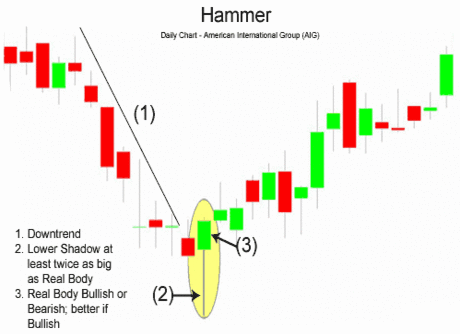
The chart below of American International Group (AIG) stock illustrates a Hammer reversal pattern after a downtrend:


In the chart above of AIG, the market began the day testing to find where demand would enter the market. AIG's stock price eventually found support at the low of the day. In fact, there was so much support and subsequent buying pressure, that prices were able to close the day even higher than the open, a very bullish sign.

The Hammer is an extremely helpful candlestick pattern to help traders visually see where support and demand is located. After a downtrend, the Hammer can signal to traders that the downtrend could be over and that short positions should probably be covered.

However, other indicators should be used in conjunction with the Hammer candlestick pattern to determine buy signals, for example, waiting a day to see if a rally off of the Hammer formation continues or other chart indications such as a break of a downward trendline. But other previous day's clues could enter into a traders analysis. An example of these clues, in the chart above of AIG, shows three prior day's Doji's (signs of indecision) that suggested that prices could be reversing trend; in that case and for an aggressive buyer, the Hammer formation could be the trigger to go long.

The bearish version of the Hammer is the Hanging Man formation (see: Hanging Man). Another similar candlestick pattern to the Hammer is the Dragonfly Doji (see: Dragonfly Doji).

Hanging Man Candlestick

The Hanging Man candlestick formation, as one could predict from the name, is a bearish sign. This pattern occurs mainly at the top of uptrends and is a warning of a potential reversal downward. It is important to emphasize that the Hanging Man pattern is a warning of potential price change, not a signal, in and of itself, to go short.


The Hanging Man formation, just like the Hammer, is created when the open, high, and close are roughly the same price. Also, there is a long lower shadow, which should be at least twice the length of the real body.

When the high and the open are the same, a bearish Hanging Man candlestick is formed and it is considered a stronger bearish sign than when the high and close are the same, forming a bullish Hanging Man (the bullish Hanging Man is still bearish, just less so because the day closed with gains).

After a long uptrend, the formation of a Hanging Man is bearish because prices hesitated by dropping significantly during the day. Granted, buyers came back into the stock, future, or currency and pushed price back near the open, but the fact that prices were able to fall significantly shows that bears are testing the resolve of the bulls. What happens on the next day after the Hanging Man pattern is what gives traders an idea as to whether or not prices will go higher or lower.

Hanging Man Candlestick Chart Example

The chart below of Alcoa (AA) stock illustrates a Hanging Man, and the large red bearish candle after the Hanging Man strengthens the bears thinking that a downward reversal is coming:


In the chart above of Alcoa, the market began the day testing to find where demand would enter the market. Alcoa's stock price eventually found support at the low of the day. The bears' excursion downward was halted and prices ended the day slightly above the close.

Confirmation that the uptrend was in trouble occured when Alcoa gapped down the next day and continued downward creating a large bearish red candle. To some traders, this confirmation candle, plus the fact that the upward trendline support was broken, gave the signal to go short.

It is important to repeat, that the Hanging Man formation is not the sign to go short; other indicators such as a trendline break or confirmation candle should be used to generate sell signals.

The bullish version of the Hanging Man is the Hammer formation (see: Hammer) that occurs after downtrends.

Harami Candlestick

The Harami (meaning "pregnant" in Japanese) Candlestick Pattern is a reversal pattern. The pattern consists of two Candlesticks:
  • Larger Bullish or Bearish Candle (Day 1)
  • Smaller Bullish or Bearish Candle (Day 2)

The Harami Pattern is considered either bullish or bearish based on the criteria below:

Bearish Harami: A bearish Harami occurs when there is a large bullish green candle on Day 1 followed by a smaller bearish or bullish candle on Day 2. The most important aspect of the bearish Harami is that prices gapped down on Day 2 and were unable to move higher back to the close of Day 1. This is a sign that uncertainty is entering the market.

Bullish Harami: A bullish Harami occurs when there is a large bearish red candle on Day 1 followed by a smaller bearish or bullish candle on Day 2. Again, the most important aspect of the bullish Harami is that prices gapped up on Day 2 and price was held up and unable to move lower back to the bearish close of Day 1.

Harami Candlestick Chart Example

The chart below of the Nasdaq 100 E-mini Futures contract shows an example of both a bullish and bearish Harami candlestick pattern:


The first Harami pattern shown above on the chart of the E-mini Nasdaq 100 Future is a bullish reversal Harami. First there was a long bearish red candle. Second, the market gapped up at the open. In the case above, Day 2 was a bullish candlestick, which made the bullish Harami even more bullish.

Harami Candlestick Buy Signal

A buy signal could be triggered when the day after the bullish Harami occured, price rose higher, closing above the downward resistance trendline. A bullish Harami pattern and a trendline break is a potent combination resulting in a strong buy signal.

The second Harami pattern shown above on the chart of the E-mini Nasdaq 100 Future is a bearish reversal Harami. The first candle was a long bullish green candle. On the second candle, the market gapped down at the open. The chart above of the e-mini shows that Day 2 was a bearish candlestick; this made the bearish Harami even more bearish.

Harami Candlestick Sell Signal

A sell signal could be triggered when the day after the bearish Harami occured, price fell even further down, closing below the upward support trendline. When combined, a bearish Harami pattern and a trendline break is a strong indication to sell.

A somewhat opposite two candlestick reversal pattern is the Bearish Engulfing Pattern (see: Bearish Engulfing Pattern) and the Bullish Engulfing Pattern (see: Bullish Engulfing Pattern).

Inverted Hammer Candlestick

The Inverted Hammer candlestick formation occurs mainly at the bottom of downtrends and is a warning of a potential reversal upward. It is important to note that the Inverted pattern is a warning of potential price change, not a signal, in and of itself, to buy.


The Inverted Hammer formation, just like the Shooting Star formation, is created when the open, low, and close are roughly the same price. Also, there is a long upper shadow, which should be at least twice the length of the real body.

When the low and the open are the same, a bullish Inverted Hammer candlestick is formed and it is considered a stronger bullish sign than when the low and close are the same, forming a bearish Hanging Man (the bearish Hanging Man is still considered bullish, just not as much because the day ended by closing with losses).

After a long downtrend, the formation of an Inverted Hammer is bullish because prices hesitated their move downward by increasing significantly during the day. Nevertheless, sellers came back into the stock, future, or currency and pushed prices back near the open, but the fact that prices were able to increase significantly shows that bulls are testing the power of the bears. What happens on the next day after the Inverted Hammer pattern is what gives traders an idea as to whether or not prices will go higher or lower.

Inverted Hammer Candlestick Chart Example

The chart below of the S&P 500 Futures contract shows the Inverted Hammer foreshadowing future price increases:


In the chart above of e-mini future, the market began the day by gapping down. Prices moved higher, until resistance and supply was found at the high of the day. The bulls' excursion upward was halted and prices ended the day below the open.

Confirmation that the dowtrend was in trouble occured the next day when the E-mini S&P 500 Futures contract gapped up the next day and continued to move upward, creating a bullish green candle. To some traders, this confirmation candle, plus the fact that the downward trendline resistance was broken, gave the signal to go long.

It is important to repeat, that the Inverted Hammer formation is not the signal to go long; other indicators such as a trendline break or confirmation candle should be used to generate the actual buy signal.

The bearish version of the Inverted Hammer is the Shooting Star formation (see: Shooting Star) that occurs after an uptrend.

Morning Star Candlestick

The Morning Star Pattern is a bearish reversal pattern, usually occuring at the bottom of a downtrend. The pattern consists of three candlesticks:
  • Large Bearish Candle (Day 1)
  • Small Bullish or Bearish Candle (Day 2)
  • Large Bullish Candle (Day 3)

The first part of a Morning Star reversal pattern is a large bearish red candle. On the first day, bears are definitely in charge, usually making new lows.

The second day begins with a bearish gap down. It is clear from the opening of Day 2 that bears are in control. However, bears do not push prices much lower. The candlestick on Day 2 is quite small and can be bullish, bearish, or neutral (i.e. Doji).

Generally speaking, a bullish candle on Day 2 is a stronger sign of an impending reversal. But it is Day 3 that holds the most significance.

Day 3 begins with a bullish gap up, and bulls are able to press prices even further upward, often eliminating the losses seen on Day 1.

Morning Star Candlestick Chart Example

The chart below of the S&P 400 Midcap exchange traded fund (MDY) shows an example a Morning Star bullish reversal pattern that occured at the end of a downtrend:


Day 1 of the Morning Star pattern for the Midcap 400 (MDY) chart above was a strong bearish red candle. Day 2 continued Day 1's bearish sentiment by gapping down. However, Day 2 was a Doji, which is a candlestick signifying indecision. Bears were unable to continue the large decreases of the previous day; they were only able to close slightly lower than the open.

Day 3 began with a bullish gap up. The bulls then took hold of the Midcap 400 exchange traded fund for the entire day. Also, Day 3 broke above the downward trendline that had served as resistance for MDY for the past week and a half. Both the trendline break and the classic Morning Star pattern gave traders a signal to go long and buy the Midcap 400 exchange traded fund.

The Morning Star pattern is a very powerful three candlestick bullish reversal pattern. The bearish equivalent of the Morning Star is the Evening Star pattern (see: Evening Star).

Piercing Line Pattern

The Piercing Pattern is a bullish candlestick reversal pattern, similar to the Bullish Engulfing Pattern (see: Bullish Engulfing Pattern). There are two components of a Piercing Pattern formation:
  • Bearish Candle (Day 1)
  • Bullish Candle (Day 2)

A Piercing Pattern occurs when a bullish candle on Day 2 closes above the middle of Day 1's bearish candle.

Moreover, price gaps down on Day 2 only for the gap to be filled (see: Gaps) and closes significantly into the losses made previously in Day 1's bearish candlestick.

The rejection of the gap up by the bulls is a major bullish sign, and the fact that bulls were able to press further up into the losses of the previous day adds even more bullish sentiment. Bulls were successful in holding prices higher, absorbing excess supply and increasing the level of demand.

Piercing Pattern Candlestick Chart Example

The chart below of Intel (INTC) stock illustrates an example of the Piercing Pattern:


Piercing Pattern Candlestick Buy Signal

Generally other technical indicators are used to confirm a buy signal given by the Piercing Pattern (i.e. downward trendline break). Since the Piercing Pattern means that bulls were unable to completely reverse the losses of Day 1, more bullish movement should be expected before an outright buy signal is given. Also, more volume than usual on the bullish advance on Day 2 is a stronger indicator that bulls have taken charge and that the prior downtrend is likely ending.

A more bullish reversal pattern is the Bullish Engulfing Pattern (see: Bullish Engulfing Pattern) that completely reverses the losses of Day 1 and adds new gains.

For further study, the bearish equivalent of the Piercing Pattern is the Dark Cloud Cover Pattern (see: Dark Cloud Cover).

Shooting Star Indicator

The Shooting Star candlestick formation is a significant bearish reversal candlestick pattern that mainly occurs at the top of uptrends.


The Shooting formation is created when the open, low, and close are roughly the same price. Also, there is a long upper shadow, generally defined as at least twice the length of the real body.

When the low and the close are the same, a bearish Shooting Star candlestick is formed and it is considered a stronger formation because the bears were able to reject the bears completely plus the bears were able to push prices even more by closing below the opening price.

The Shooting Star formation is considered less bearish, but nevertheless bearish when the open and low are roughly the same. The bears were able to counteract the bears, but were not able to bring the price back to the price at the open.

The long upper shadow of the Shooting Star implies that the market tested to find where resistance and supply was located. When the market found the area of resistance, the highs of the day, bears began to push prices lower, ending the day near the opening price. Thus, the bullish advance upward was rejected by the bears.

Shooting Star Candlestick Chart Example

The chart below of Cisco Systems (CSCO) illustrates a Shooting Star reversal pattern after an uptrend:


In the chart above of CSCO, the market began the day testing to find where supply would enter the market. CSCO's stock price eventually found resistance at the high of the day. In fact, there was so much resistance and subsequent selling pressure, that prices were able to close the day significantly lower than the open, a very bearish sign.

The Shooting Star is an extremely helpful candlestick pattern to help traders visually see where resistance and supply is located. After an uptrend, the Shooting Star pattern can signal to traders that the uptrend could be over and that long positions should probably be reduced or completely exited.

However, other indicators should be used in conjunction with the Shooting Star candlestick pattern to determine sell signals, for example, waiting a day to see if prices continued falling or other chart indications such as a break of an upward trendline.

For aggressive traders, the Shooting Star pattern illustrated above could be used as the sell signal. The red portion of the candle (the difference between the open and close) was so large with CSCO, that it could be considered the same as a bearish candle occuring on the next day. However, caution would have to be used because the close of the Shooting Star rested right at the uptrend support line for Cisco Systems.

Generally speaking though, a trader should wait for a confirmation candle before entering.

The bullish version of the Shooting Star formation is the Inverted Hammer formation (see: Inverted Hammer) that occurs at bottoms. Another similar candlestick pattern in look and interpretation to the Shooting Star pattern is the Gravestone Doji (see: Gravestone Doji).

Tweezer Tops and Bottoms

The Tweezer Top formation is a bearish reversal pattern seen at the top of uptrends and the Tweezer Bottom formation is a bullish reversal pattern seen at the bottom of downtrends.

Tweezer Top formation consists of two candlesticks:
  • Bullish Candle (Day 1)
  • Bearish Candle (Day 2)

Tweezer Bottom formation consists of two candlesticks:
  • Bearish Candle (Day 1)
  • Bullish Candle (Day 2)

Sometimes Tweezer Tops or Bottoms have three candlesticks.

A bearish Tweezer Top occurs during an uptrend when bulls take prices higher, often closing the day off near the highs (a bullish sign). However, on the second day, how traders feel (i.e. their sentiment) reverses completely. The market opens and goes straight down, often eliminating the entire gains of Day 1.

The reverse, a bullish Tweezer Bottom occurs during a downtrend when bears continue to take prices lower, usually closing the day near the lows (a bearish sign). Nevertheless, Day 2 is completely opposite because prices open and go nowhere but upwards. This bullish advance on Day 2 sometimes eliminates all losses from the previous day.

Tweezer Bottom Candlestick Chart Example


A Tweezer Bottom is shown below in the chart of Exxon-Mobil (XOM) stock:

The bears pushed the price of Exxon-Mobil (XOM) downwards on Day 1; however, the market on Day 2 opened where prices closed on Day 1 and went straight up, reversing the losses of Day 2. A buy signal would generally be given on the day after the Tweezer Bottom, assuming the candlestick was bullish green.

An interesting chart and explanation of what occurs intra-day during a Tweezer Top and Bottom is discussed on the next page.

Intra-day Tweezer Tops and Bottoms

The bullish Tweezer Bottom formation shown on the last page of the daily chart of Exxon-Mobil is shown below with a 15-minute chart spanning the two days the Tweezer Bottom pattern was emerging:


Notice how Exxon-Mobil (XOM) stock went downwards the whole day on Day 1. Then on Day 2, the bearish sentiment of Day 1 was completely reversed and XOM stock went up the whole day. This sudden and drastic change of opinion between Day 1 and Day 2 could be viewed as an overnight transfer of power from bears to bulls.

The 15-minute chart below of the E-mini Russell 2000 Futures contract shows how a three day Tweezer Top usually develops:


On Day 1, the bulls were in charge of the Russell 2000 E-mini. On Day 2, however, the bulls began the day trying to make a new high, but were rejected by the overhead resistance created by the prior day's highs. The market then sank quickly only to recover halfway by the end of the close on Day 2. Day 3 opened with a spectacular gap up, but the bulls were promptly rejected by the bears at the now established resistance line. The Russell 2000 E-mini then fell for the rest of the day. Many classic chartists will recognize this triple Tweezer Top as a Double Top formation (see: Double Top).

The Tweezer Top and Bottom reversal pattern is extremely helpful because it visually indicates a transfer of power and sentiment from the bulls and the bears. Of course other technical indicators should be consulted before making a buy or sell signal based on the Tweezer patterns.

Accumulation Distribution

Accumulation Distribution uses volume to confirm price trends or warn of weak movements that could result in a price reversal.
  • Accumulation: Volume is considered to be accumulated when the day's close is higher than the previous day's closing price. Thus the term "accumulation day"
  • Distribution: Volume is distributed when the day's close is lower than the previous day's closing price. Many traders use the term "distribution day"

Therefore, when a day is an accumulation day, the day's volume is added to the previous day's Accumulation Distribution Line. Similarly, when a day is a distribution day, the day's volume is subtracted from the previous day's Accumulation Distribution Line.

The main use of the Accumulation Distribution Line is to detect divergences between the price movement and volume movement. An example of the Accumulation Distribution Line is shown below in the chart of the Nasdaq 100 exchange traded fund QQQQ:


Volume Interpretation

The basic interpretation of volume goes as follows:
  • Increasing and decreasing prices are confirmed by increasing volume.
  • Increasing and decreasing prices are not confirmed and warn of future trouble when volume is decreasing.

For more in-depth analysis of Volume (see: Volume).

High #1 to High #2

The Nasdaq 100 made an equal high (i.e. Double Top formation) at High #2; however, the Accumulation Distribution Line failed to make an equal high, in fact it made a lower high. On average, less volume was transacted on the move higher at High #2 than occured on the first move higher at High #1; thus, this could be interpreted as there being less strength and conviction behind the rally in the Nasdaq the second move higher. This failure of the Accumulation Distribution Line signaled a strong bearish divergence.

High #3 to High #4

Again, the Accumulation Distribution line made a lower high, even though the Nasdaq 100 this time made a higher high. This bearish divergence warned that the second move to make a higher high in price lacked conviction.

Low #1 to Low #2

The bearish divergence from Low #1 to Low #2 confirmed the later bearish divergence of High #3 to High #4. On average, more volume was occuring on down days than up days, even while the Nasdaq 100 was making higher highs and higher lows, which usually is considered a sign of strength.

In summary, the Accumulation Distribution Line is a very effective tool to confirm price action and show warnings of potential price reversals. It is important to incorporate volume into price analysis, and the Accumulation Distribution Line is one of many indicators to do just this. Other indicators that include price and volume analysis and could be considered more accurate than the Accumulation Distribution Line include the Chaikin Oscillator (see: Chaikin Oscillator), Money Flow Index (see: Money Flow Index), and Price Volume Trend indicator (see: Price Volume Trend).